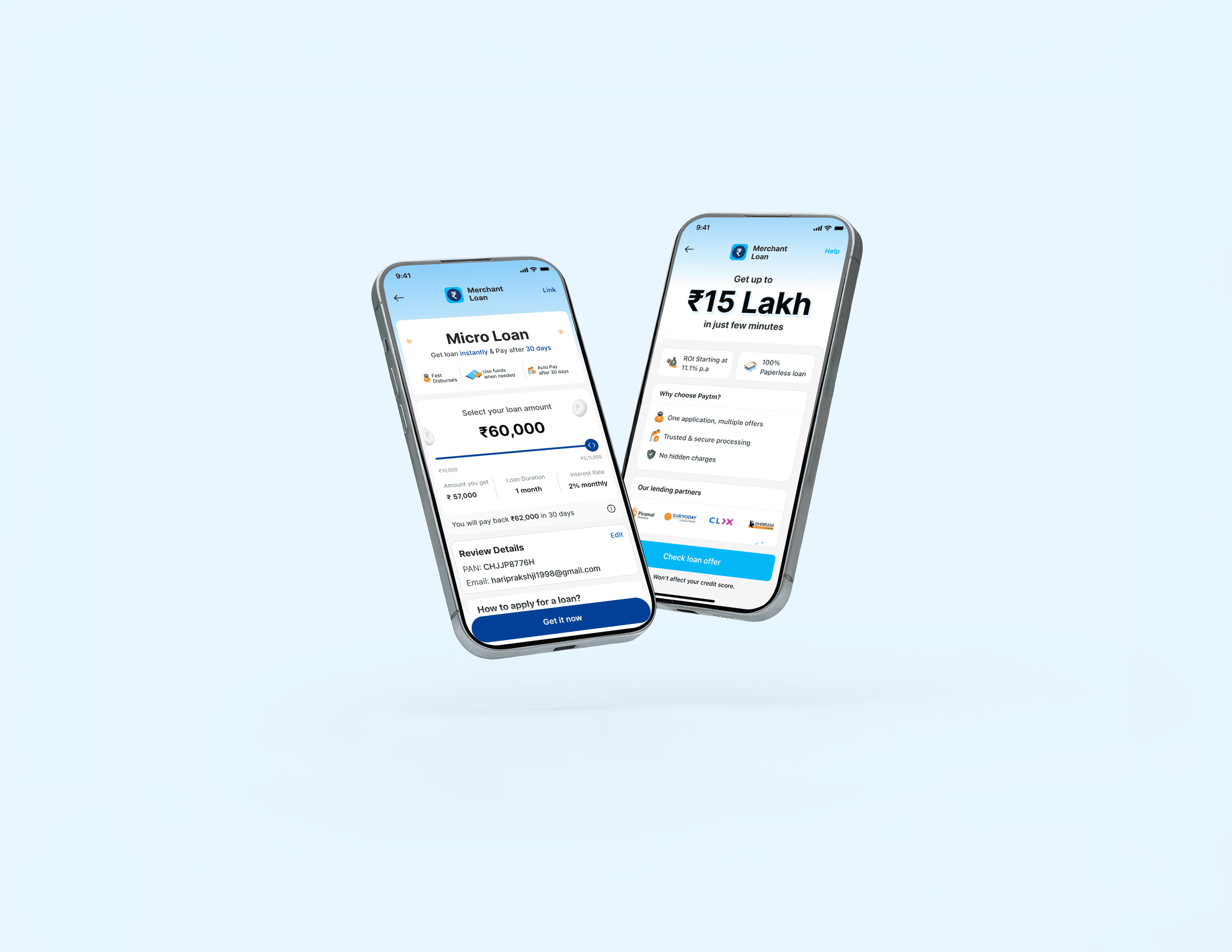
Why This Product Exists
Fintech platforms in India typically design loan products for larger amounts and longer repayment cycles. But internal Paytm data showed a different pattern; the majority of Paytm's merchants were low-income, small-scale business owners who needed smaller amounts, quickly, with short repayment windows.
This gap led to design a micro-loan experience built around how these users actually think and behave, not how fintech assumes they do. It also became a chance to rethink the existing lending flow entirely.
How might we design a micro-loan experience for low-income merchants that is easy to understand, transparent and trustworthy, and quick to apply for and repay while also improving the existing experience?
Research
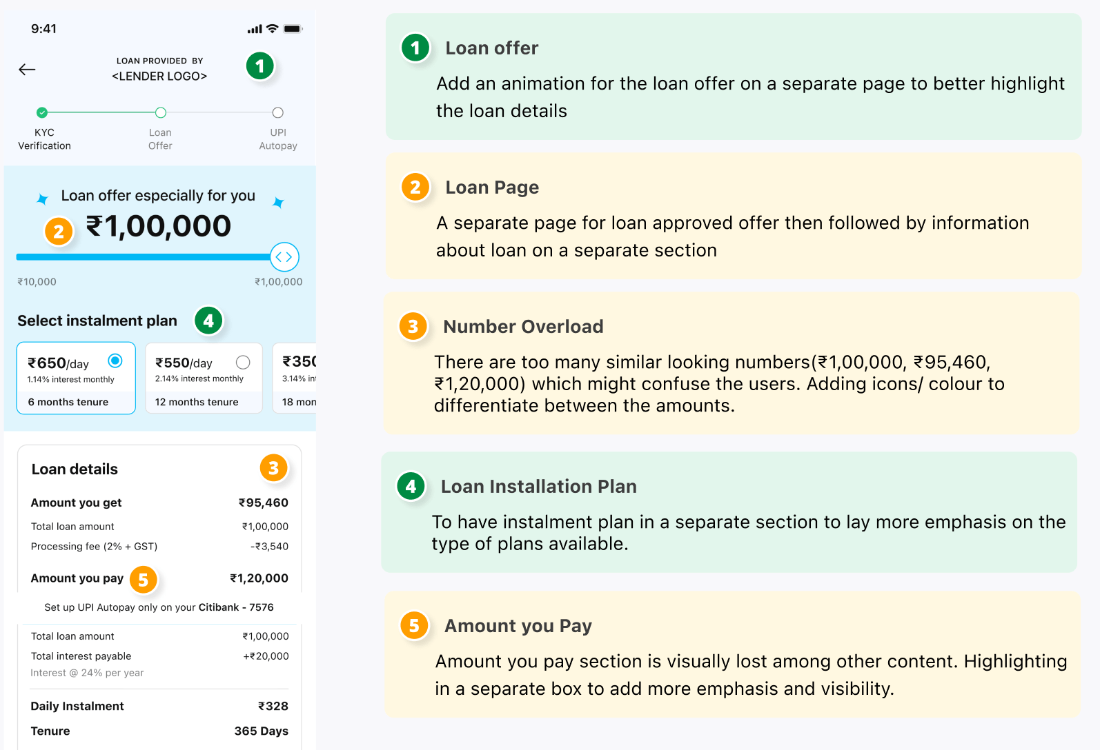
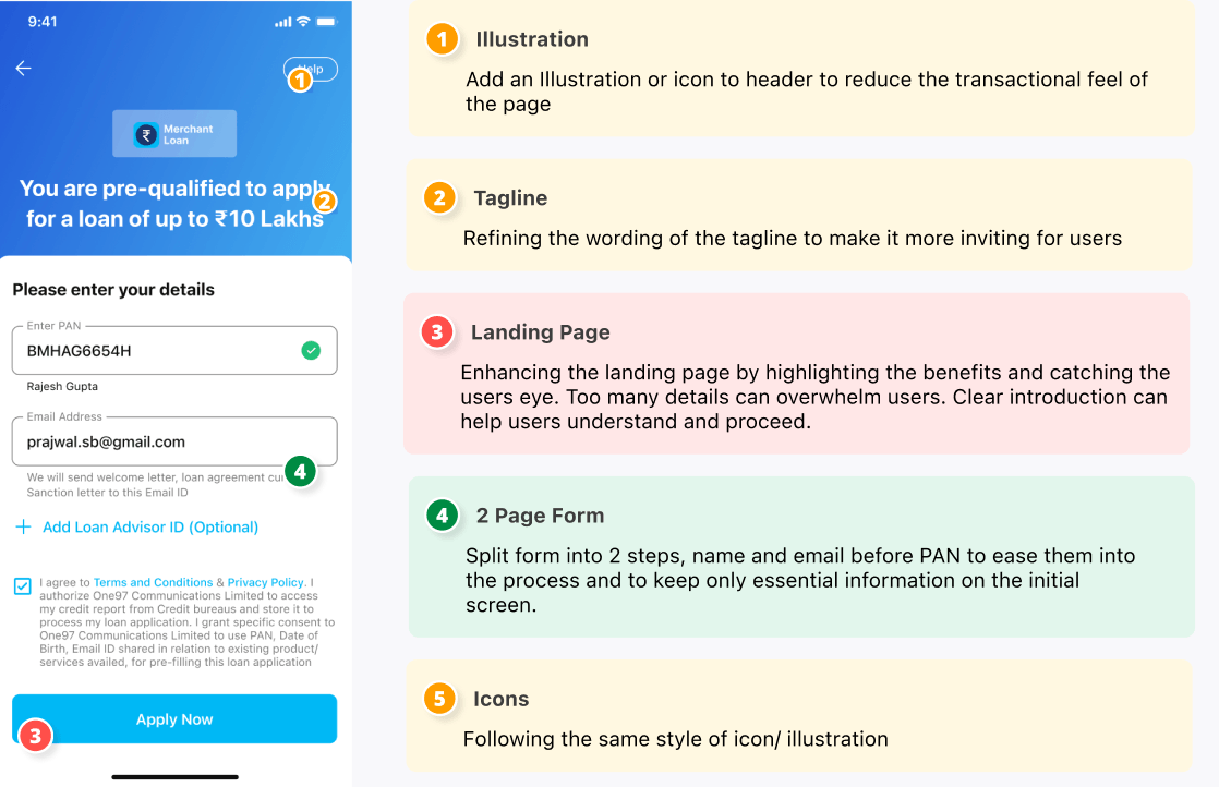
UX Audit
I audited the existing lending flow screen by screen, mapping where users would drop off and why.
Pain Points
Lack of Loan Awareness
Users didn't understand loan timelines, deductions, or required documents.
Overwhelming Landing Page
Text-heavy, unclear on benefits or eligibility. Users quit before even starting.
No Feedback During Wait Times
No progress indicators at key steps, users thought the app had frozen.
YouTube Comments Analysis
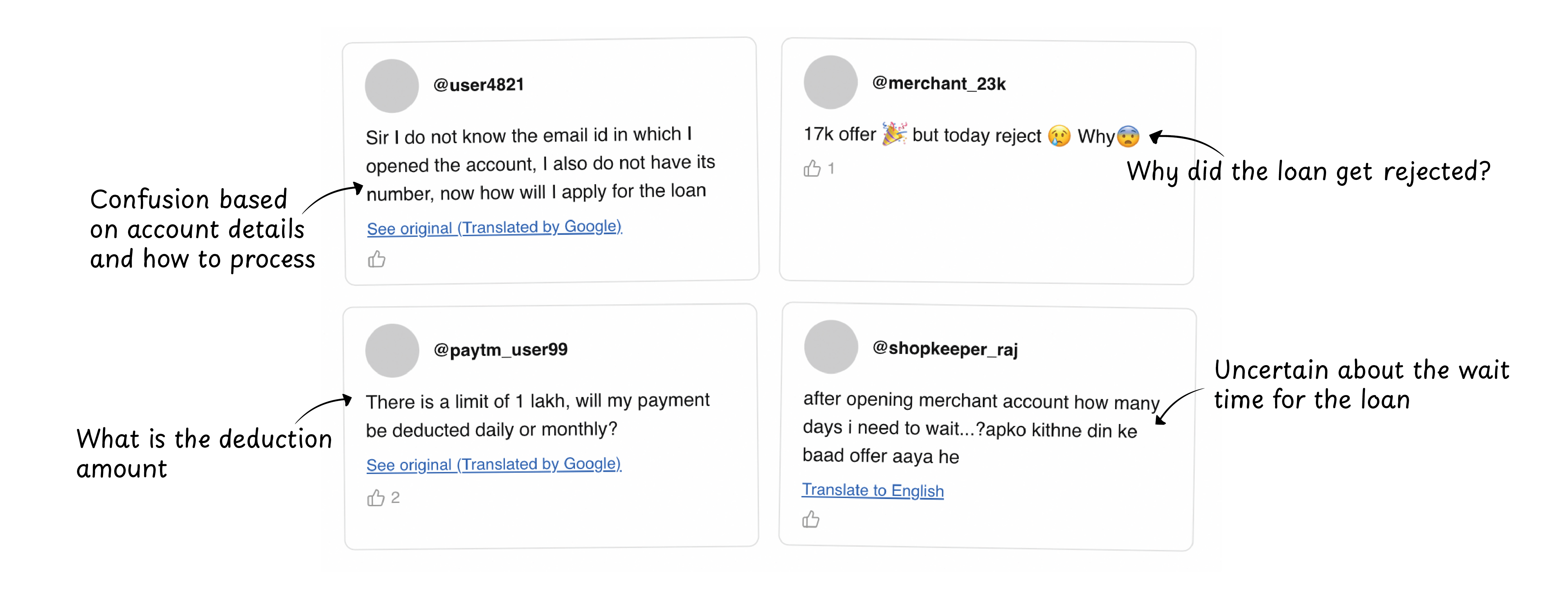
The main goal was understanding the users. I explored real-world user behavior through YouTube. Many creators publish videos in Hindi and simplified English explaining how merchant loans works. These videos target users who are not fluent in English, are new to digital financial systems or who learn through easy explanations.
I analyzed the comment section of these videos to understand user tone, the language they communicate in and exactly where they get stuck.
Competitive Analysis
I looked at how BharatPay, CRED, and PhonePe handle merchant lending to understand the current landscape.
BharatPay
Quick onboarding, minimal docs, transaction-based approvals optimised for Tier 2/3 users.
CRED
Animations and gamified feedback make financial actions feel light and premium.
PhonePe
Clean UI with merchant dashboard and multilingual support. Loans tied to transaction history.
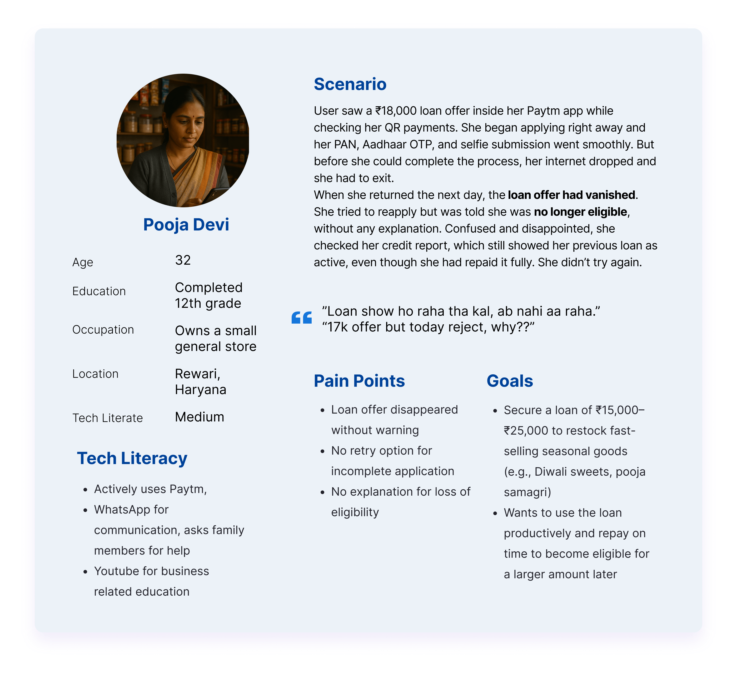
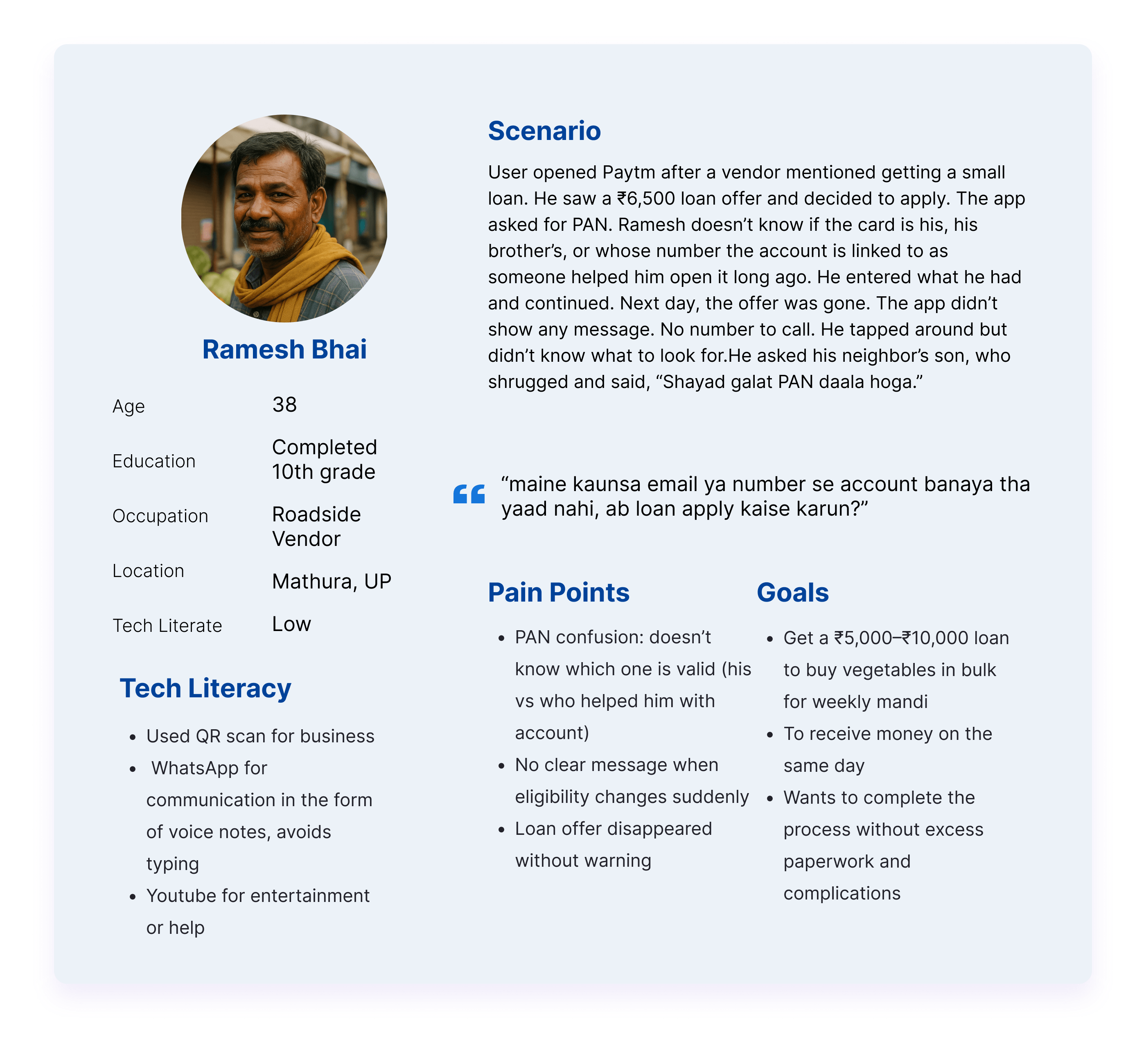
User Personas
Design Process
The audit, the comments, and the competitor research all pointed to the same thing: users weren't confused by the loan, they were confused by the product.
Design Principles
Clarity over complexity
Plain language throughout. Never assume users know what "tenure" or "EMI" means.
Education upfront
Explain what a micro-loan is before users enter the flow.
Transparency builds trust
Show loan amount, tenure, and interest rate early before the user commits.
Wireframes
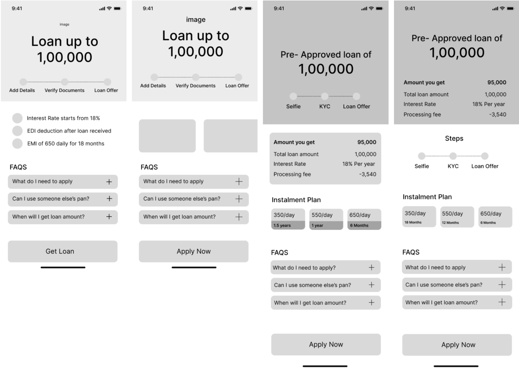
I created wireframes to address key moments of confusion and drop-off in the existing flow. The main focus was designing a landing page that clearly communicated the product and surfaced the information users needed upfront. I worked through quick iterations and shared these with the product and business teams to gather feedback and validate the direction.
Iterations
Without the loan slider, the information wasn't very clear
Users wanted more specific information that would benefit and inform them
Iteration 1 showed users needed more control over the amount and clearer financial details upfront — which directly shaped Iteration 2
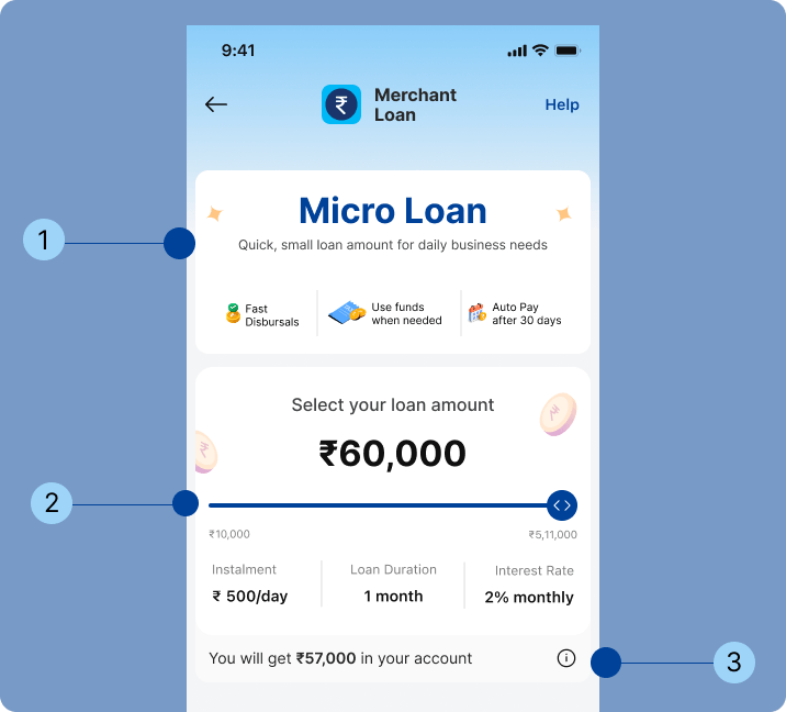
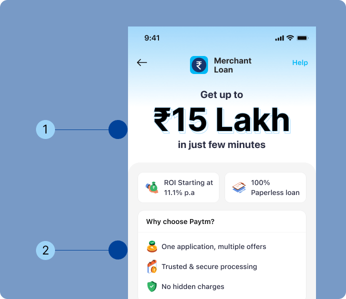
Named the product — "Micro Loan" explained upfront. Transparency = Trust
Slider showed installment + interest in real-time
Providing all the loan information early on to keep the user informed
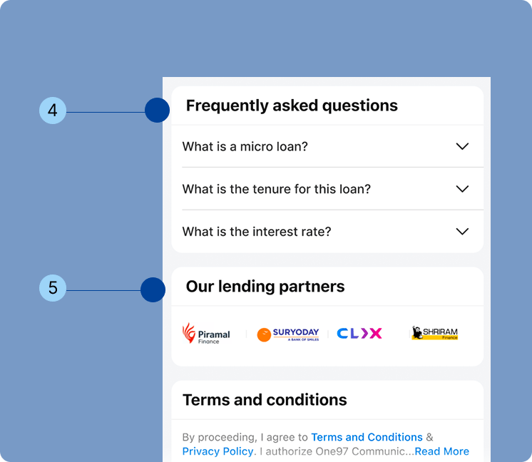
FAQ section — Based on the merchant help desk (MHD), these were the top asked questions. Providing answers early on will keep the user more informed
Social proofing builds trust within the user
Reflections
What I Learned
Research methods should match your users
YouTube comment sections gave me access to real merchants describing confusion in their own words.
Design is about legibility, not just functionality
This project showed me that clarity builds trust and that even small decisions, from language to information order, can determine whether a user moves forward or drops off.
Data over assumptions
Using merchant help desk data to build the FAQ made decisions easier to defend and the design immediately more credible.
If I Continued This Project
In-context usability testing
In-person testing with real Tier 2/3 merchants on their own devices — to see where attention falls and where it drops in real conditions.