MiDorm
Dorm Decisions, made easy
This was a team project, part of Advanced Design (SI 407) course at the University of Michigan · Figma
Why This App?
As an incoming freshman at the University of Michigan, choosing where to live can feel overwhelming. Information is scattered, there's no easy way to compare dorms, and students often rely on guesswork and word of mouth. We wanted to change that.
The Goal
To simplify the dorm selection process by organizing key information and giving students an easy way to explore, compare, and rank their options.
The Problem
Scattered across too many sources
Dorm details are scattered across multiple university pages with no central place to compare what matters.
No way to save or compare
Students can't track or compare dorms they're interested in — they rely on memory, screenshots, or external tools.
Cluttered interfaces hide what matters
Existing tools overwhelm students with dense layouts and limited visibility into what each dorm actually offers.
Research
After conducting this user research, we compiled our findings into a Product Vision Board. This method allowed us to capture the overall app implementation strategy and ensure that our app leveraged the strengths of the University.
View Product Vision Board →Design Principles
Visual descriptions of dorms
Give students a way to see what each dorm looks like and offers, not just read a list of names.
Filtering and sorting options
Let students narrow down choices based on what matters to them — location, amenities, social scene.
Dorm ranking
Allow students to build a personalized ranking so they can prioritize options based on their own preferences.
Discovery
Our ideation phase included Crazy 8 sketches and Mid-Fi wireframes.
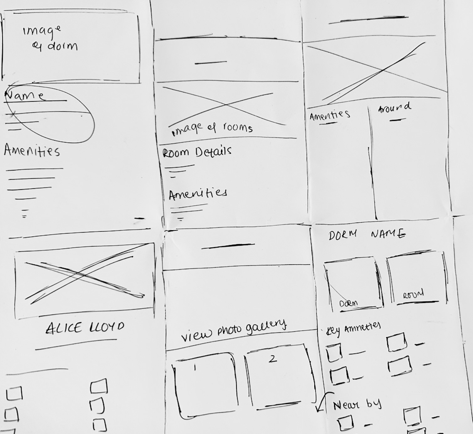
Crazy 8 sketches
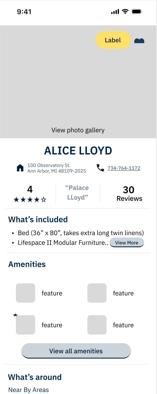
Mid-Fi wireframes
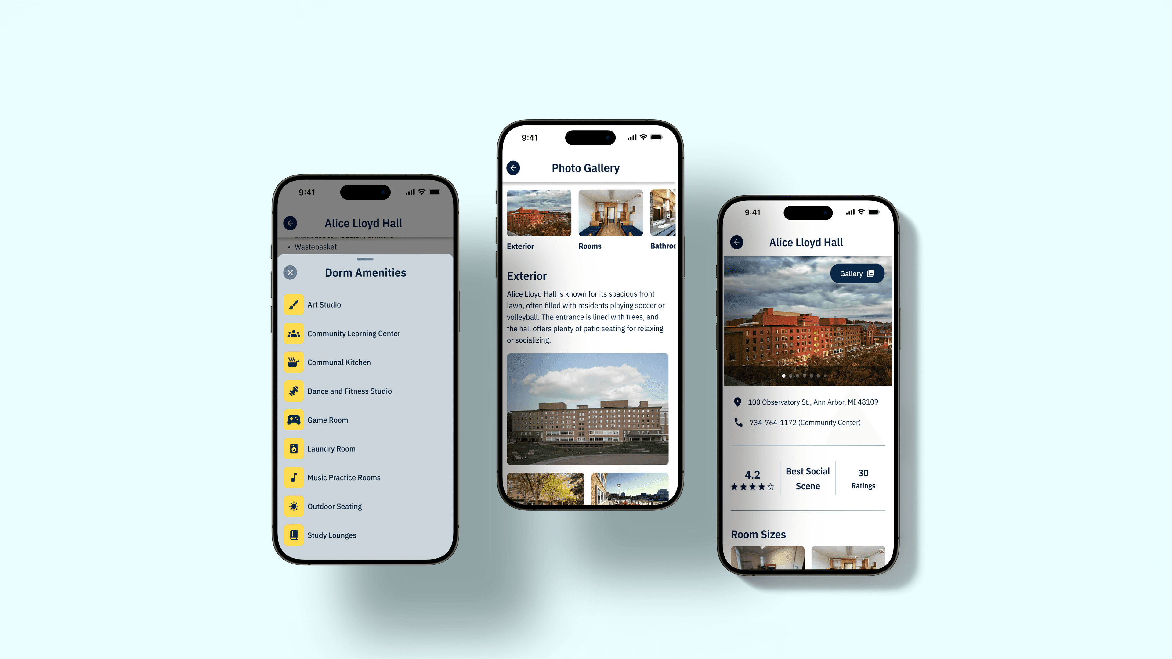
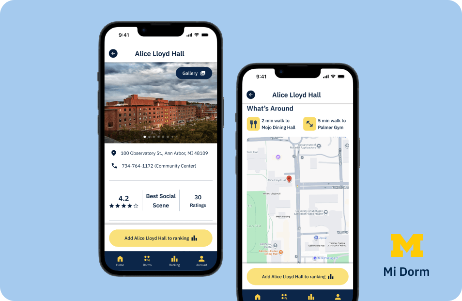
Visual details are the most engaging and useful to students. This led us to adopt a photo-first design for dorm detail screens.
Mobile First + Design System
We followed a Mobile First approach and aligned with Apple's iOS Human Interface Guidelines, and created a design system to streamline our process.
The Solution
User Testing Insights
We found that our design performed as intended. All five participants were able to complete the key tasks with ease and they appreciated the level of transparency and detail provided in the dorm information.
“The filters are really easy to scroll through”
— Diya Sankla — Senior @ UMich
“I really appreciated pictures of the dorms because I didn't have that when initially going through the process”
— Reeva Bohra — Junior @ UMich
Revisions
Diverse preferences for contacting roommates outside of in-app messaging → Allowed users to share multiple third-party contact methods (email, phone number, Instagram, etc.) with their roommate
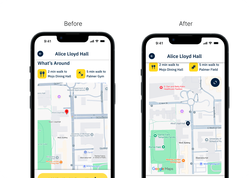
Desire for more functionality out of dorm maps → Allowed users to explore nearby campus buildings and see dorm-to-building distance estimates
Developer Handoff
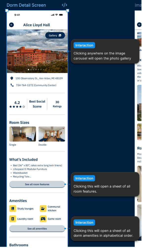
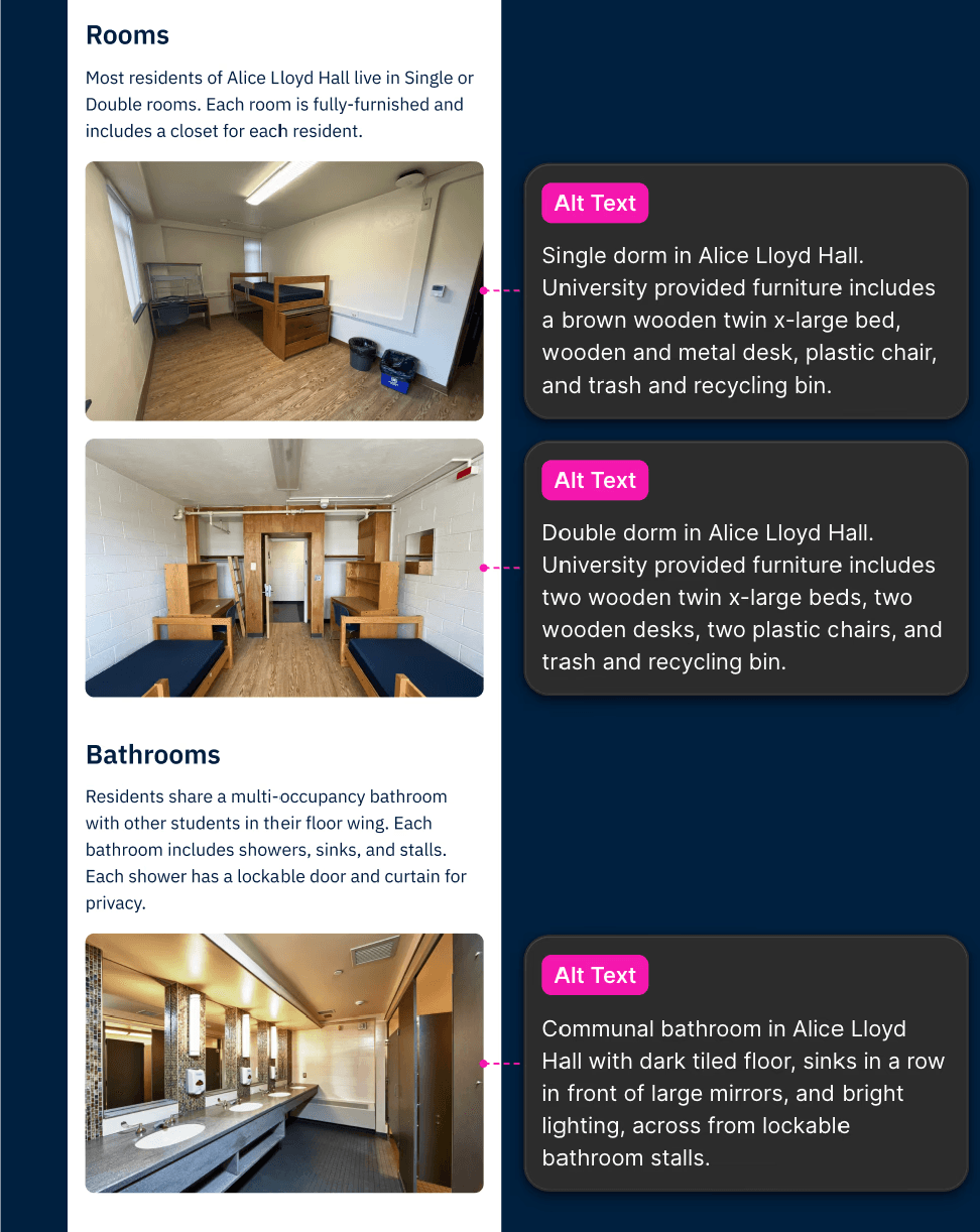
We created a detailed developer handoff that captures both the functionality and the native iOS behavior of MiDorm. We noted our color and typography styles for easy reuse, annotated intended screen content states and component interactions, and documented hardware-integrated features (e.g., when the user's camera or photo library is triggered).
Reflections
Our Approach
A native app for a common U-M student problem that currently has no university-specific solution. Building within the U-M system required navigating both Apple's iOS guidelines and the University's design standards, often making tradeoffs where they conflicted. Despite these constraints, our decisions consistently prioritized user needs and expectations.
Next Sprint
In our next sprint, we would enhance visual dorm details by adding student-created video walkthroughs to build transparency and trust. We would also conduct additional user research to identify the most valuable features and guide future updates.